Mad Hatters Indoor Play Centre Logo & Brand Development
Mad Hatters Indoor Play Centre approached us to create a fun, recognisable brand identity that would appeal to both children and parents. They had a clear starting vision: soft pastel colours and a subtle nod to Alice in Wonderland, which needed to be developed into a cohesive, usable brand.
The Approach
We began by refining their initial ideas into a structured visual direction. The goal was to strike a balance between playful and professional, something imaginative enough for children, while still feeling trustworthy for parents.
A pastel colour palette was carefully developed to create a soft, welcoming feel, avoiding overly bright or harsh tones. Typography was selected to reflect a sense of fun and whimsy, while remaining clear and legible across signage, menus, and digital use.
Logo Development
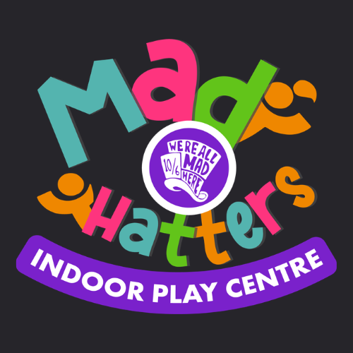
The logo design took inspiration from the “Mad Hatter” theme, incorporating subtle visual cues inspired by Alice in Wonderland without becoming overly literal. The result is a distinctive, character-led identity that feels unique, memorable, and on-brand for a children’s play environment.
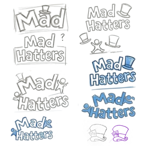
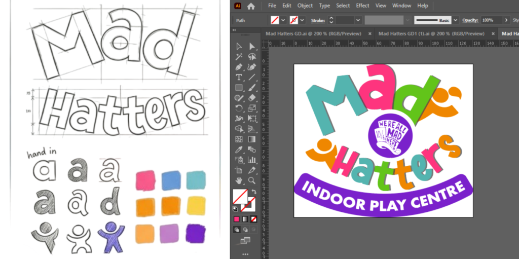
From Sketch to Final Design
Initial concepts were developed through hand-drawn sketches, allowing for quick exploration of ideas and creative direction. Once a clear concept was chosen, the design was refined and digitised using Adobe Illustrator.
This process ensured that the final logo was created as a clean, scalable vector, allowing it to be used consistently across all applications, from large-scale signage to small print and digital displays, without any loss in quality.
The Outcome
The final brand delivers a cohesive and versatile identity that works across all touchpoints, from signage and print materials to social media and merchandise. It captures the playful imagination of the concept while maintaining a polished, professional finish.